A website or mobile application has to open quickly and perform efficiently to achieve SERPs and user loyalty. That’s where the User Interface (UI) and User Experience (UX) step in. UI is about the interaction between the user and the product while UX is the emotional outcome of the interaction. They go hand in hand and are equally important for Web Designing.
Here’re 8 universal UI and UX designing rules for all web developers to know and imbibe.
10 Mind-Blowing Tips To Make App Development Successful
Rules of UX for Web Designing Projects:
UX design usually precedes UI design. So, let’s start with the UX design strategies.
1. Keep it Responsive:
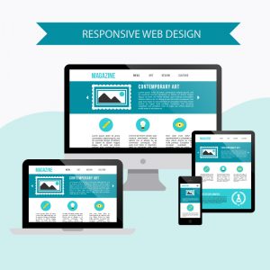
Websites and apps receive significant traffic via Smartphones. Your website needs to be responsive and mobile-friendly. These types of websites incorporate fluid and flexible layout that fits all screen sizes (from Smartphones and tabs to desktops) for an optimized browsing experience. Even Google algorithms prefer responsive and mobile-friendly websites for SERPs. However, ensure the responsive element doesn’t interfere with the website quality.
2. Ensure Quick Loading Time:

Your website should load quickly. Slow load times not only frustrate users but also hamper interaction. Users prefer not to visit a website with a slow load time more than once. No one has the time and inclination for slow page loading time, after all. Such sites do not find favor with search engines either. Ensure going through WordPress resources for tips on speeding up your websites. Also, opt for a good web hosting server to keep your loading speeds up to the mark.
3. Make it Bulleted:
Users find it hard to deal with lengthy content, as it involves time and effort. Bullets, on the other hand, present all relevant information about your product or service in an easy to read format. The user can go through the information quickly and easily, and make buying decisions accordingly. The bullets can be paired with images to make the page look more attractive, and at the same time raise user engagement, product awareness and conversion rates.
4. Color is Important:
Color is perhaps the biggest visual element of your website. The right color helps the website connect with the audience and send the right message across. Research suggests that different colors invoke different feelings. For example, bright yellow represents energy, and golden shades stand for antiquity, lavishness and wisdom. You are better off deciding colors for your website and the buttons based on the product you sell and your business’s bottom line.
Rules of UI for Web Designing Projects
Now that UX design essentials are out of the way, it’s time to focus on the UI design strategies.
1. Keep the page Importance-Based:
The thumb rule for a fine UI is to keep the page layout simple and importance-based. All key information needs to be presented in a way to attract user attention and ensure accessibility.
To this end, factor in the special relationship between all the page elements and put the UI elements thoughtfully. Avoid clutter and minimize visual elements. For readability sake, make the most of the headings, club similar elements collectively and add numbered items.
2. Stick to common UI Elements:
In web designing services, form follows function. That calls for using common UI elements instead of unfamiliar, new ones to create your user interface. The user should be able to interact with the product quickly and easily, after all. Creativity can be compromised for the sake of functionality.
3. Be Good with Color and Texture Usage:
The interface needs to be attractive and coherent, in line with the overall design scheme. So, be mindful of the hues, texture, contrast, and light when creating a user interface. All of them should be used strategically to draw user attention to the key information presented.
4. One Screen, One Action:
Visual clutter is detrimental for to website/app. It makes sense to endorse the one screen, one action principal. Herein, one screen should support one primary action only. Too many actions fitted into one screen confuse and distract the user, leading to low retention rates.


